Thursday 29 January 2015

Final Blog

This year i have found the process of making a music video very challenging, i have enjoyed using the different technologies such as final cute pro and photoshop. what i think has been one of my most successful outcome is my digipak and magazine advert that i made in photoshop. I enjoyed creating this and think it worked well with my music video.
This year has been fun and i have learnt a lot of new techniques of editing and producing a music video.

Digipak Final edit


Final Edit of my inside panels of my digipak 

Costume


Font, Layout & design of Digipak and advert


Friday 23 January 2015

Evaluation: Question 4


14. Jaya Daniel Shannon Kyrell from 283goswell on Vimeo.

Feedback from Cinema:

When our video was done we received a substantial amount of cheers and claps which insinuates a success to me. After the screening several people came up to me and pointed various things they liked. Some of them were:

Lights - particularly the strobe lights. 
Jaya's hair looked good and was noticeable.
"The editing was the seamless and on the beat" - Stefan
"The video made me really get into the song.." - Sanaa  

Feedback from Classmates:
After the final editing deadline, the next lesson as a class we watched each others videos. The main feedback we got back was the editing was good as the pace sped up it must of got harder to edit but we done it well.
Most people were very drawn to Jaya's hair and even said they'd happily watch the video again as it was enjoyable and memorable. This links to Andrew Goodwin's visual pleasure theory.

What have I learned? 
I have learned that I can edit better than I thought I could. Editing on the beat for a music video is a good idea as it appeals to the audience. Our variety of shot types and colours kept the audience interested and corresponded well with our genre and target audience.


Evaluation: Question 3

Evaluation: Question 2


Effective/ Successful:

My digipak, advertisement and music video reflect one and other as there are various elements that are similar and consistent throughout. These similarities are; costume, hair colour and styling and colour scheme. 

Evaluation: Question 1


Notes For Evaluation Question 2


Plan for Question 2:
  • link to synergy.

  • does my promotional package promote my video well - look at similarities in digipak/advert/music video.

  • colour scheme, font, costumes, artist brand image, genre, sub genre, movement, camerawork, editing etc.

  • look back at previous blogs and assess what was our target audience - have I included these factors in our music video/digipak/advert.

  • assess the effectiveness and the success of my media products - link back to genre.

  • again look at target audience - in terms of what do we think they will think of our media products/balanced argument/what was successful and what can be improved.

  • comparisons - e.g (was the digipak better than the advertisement and the video or vide versa).

  • point out specific elements in the video that link to conventional themes in a music video.

Monday 19 January 2015

Evaluation Question 4

Evaluation question 4

 
14. Jaya Daniel Shannon Kyrell from 283goswell on Vimeo.

During the editing process of my music video i was given feedback throughout by my teachers. Dan gave us a list of improvements which i previously blogged about:

In response to the feedback we instantly acted on it and started applying it to our editing. The feedback was very important as it helped us improve our music video extremely as he pointed out things that we did notice at first, without the feedback we would of had a lot of the shots throughout our music video and this would be boring to viewers. We were able to change this by taking more base tracks and making full use of the ones we already had.

During the cinema viewing the audience seemed impressed with our music video but also had some constructive criticisms. Most of the people i asked said that they really like the fast paste editing we did in sync with the song speeding up they thought it really worked well. Additionally the audience also liked the amount of colour used in the music video and found this very attracting and kept them interested in the music video.

The audience also gave us some advice on improvement we could have made, they suggested that we could of used more effects on some of our clips such as blurring parts of clips or taking a variety of different shot types.
I think my audience feedback was very important as they are part of my target audience, their reviews made me look at my music video in a different light and helped me to analyse my own video. I agreed with some of the reviews and suggestions my audience gave and this helped me to notice the things my video lacked and in future i would add a lot more effects to my music video after hearing feedback and analysing my work myself.

Evaluation Question 3


Evaluation Question 2


Notes For Evaluation Question 1

Plan for Question 1:
  • include both music video and ancillary products.

  • link it to genre of drum n bass (bright colours/bold writing/graffiti/costumes/hair style links to brand image)

  • pace of drum n bass videos (different forms of editing/jump cuts/ fast paced editing on the beat/ speeds up as the song goes on)

  • lighting plays a key role in drum n bass, never one light source (strobe lighting to create a rave atmosphere/either changes from day to night/ flashing lights/ dimmed lighting.) - often create a party environment.

  • sigma ft paloma faith - changing - fast paced editing when the beat changed and colour scheme of graffiti inspired our music video.

  • wilkinson ft talay riley - dirty love -  dark setting with neon lights / focus on certain people rather than scenery, also the bright make up and hair contrasts with the background. 

  • meghan trainor - all about that bass - shots where jaya is laying on various fabrics / influence of loads of colours / birds eye shot/ used in the instrumental.

  •  include shots of our music video to compare to inspirations (the pace, the colours, the lighting, the editing. the camerawork).

  • andrew goodwin - (illustration/amplification/disjuncture) (how does our video link to andrew goodwins theory of 'visual pleasure'?)(how does our choice of video embed it in the audiences mind?)

  • carol vernallis - (editing/camera movement & framing/ narrative/diegesis)(narrative - she believes the lyrics reflect the song but the video may be disconnected from the lyrics)(editing - she states there is often a break in the continuity of editing/juxtaposed frames/pace/jump cuts (camera work - she states that certain shot types allow the audience to understand why the video is that way e.g - close ups show the artists emotions and expressions)(diegesis - the world within the video/some shots are favoured more than others to reveal the diegesis).

  • link everything to generic themes of music videos particularly link to my genre (drum n bass) and use examples of inspiring videos and other drum n bass videos. 

  • compare to the original music video to the song/annotate how mine differs and why.

Evaluation Question 1


progression of digipak


Powered by emaze

Sunday 18 January 2015

Digipak - [Poster/Advertisement]


Digipak - [Outside & Inside]

[Outside]


[Inside]


Location choice

In my group we decided to do the photo shoot in the photography studio as that is is similar to the main set of our music video. The song is a dancers song so it wouldn't have made sense to take pictures outside or anywhere with nature. The white background would mean all the focus would be on the artist. This would also make the picture a clean palette for any altering we wanted to do to it later.

possible costumes for the poster/ digipak


The main colour that i wanted P.Kaur Blue to be wearing was black. Black is also a very fashionable colour and could make the artist seem more attractive to her audience.
 I believed this to be a smart choice as this meant that her hair would stand out against what she was wearing instead of clast with it. Her hair was her synergy so we had to make it a prominent feature of both the digipak and the advertisement. 

This would also allow colourful edits and props to be used without the image as a whole too in-your-face. This would also suit the genre of music she produced as it is drum and bass. This music can sometime be dark and sad but always very deep, connecting with whatever emotion the listener is feeling. This concept is followed through the music video too as in many of the shots it is dark apart from the colourful lighting and the artist herself.

Friday 16 January 2015

inside problems


My Advert Final


Font, Colour & Design Ideas.

Font:

To make sure I produce an effective product, I plan to use only 2 types of font.
This will make my ancillary products look less chaotic and look like a successful piece of promotional work. 

Initially I planned to use standard graffiti text for the name of the artist. However, when testing it out it can appear difficult to read as the letters look squashed together.
The reason I initially wanted to use a graffiti style of text is because it is commonly associated with the drum n bass genre.
 I found with this text is that it doesn't connect with the rest of the cover as it overlaps and takes away attention from the rest of the digipak - I want it to all balance out. 


However, I still wanted to keep with theme common conventions of the genre so I opted for something similar. I chose another form of bubbled graffiti that you don't usually see on walls in public but is used in promotional packages like posters. It is more spaced out and easier to read. 


When looking at Rudimental's album 'Home' -  they had a  similar font for the name of the album. It is somewhat simple and warm - this links to drum n bass videos as they either are chaotic like a rave or tell a story of another culture like poverty in America. This simple texts doesn't clash with the font I am using for the name of the artist. 

Colours:


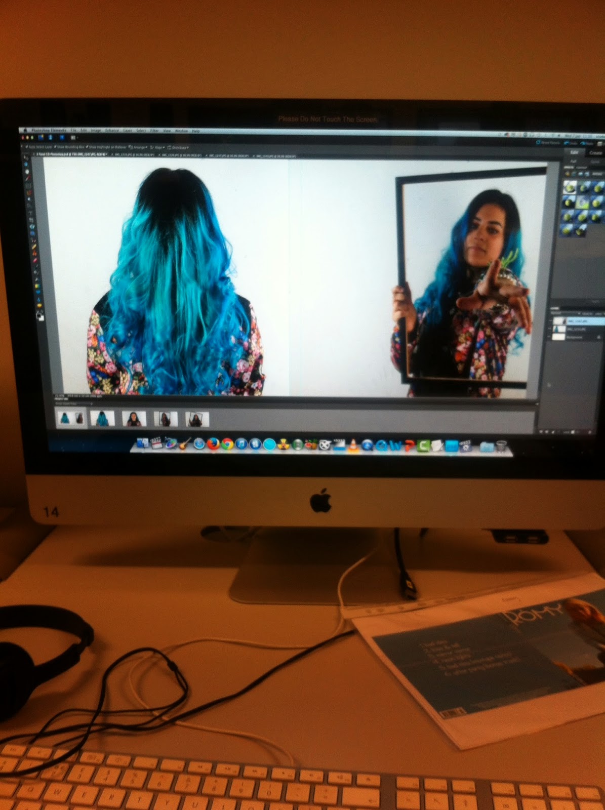
The colour scheme was the easiest part -  our artists name is 'PKaur Blue' as her hair is a vibrant blue colour. We wanted to stick with the blue colour scheme as it linked well with our video. I decided to use a lighter blue shade as in the video and digipak her hair, although two different shades of blue, is a lighter blue rather than darker. This will allow the audience to spot the correspondence between the two.

Ideas:


Like on my mock up (shown above) a large image of the artist on the front is the idea I plan to go with. It draws the audience in immediately with the bright colour hair and clothing.


Thursday 15 January 2015

do's and don'ts'

Dos'
You should stick to two clear fonts as a maximum but one for everything is preferable. They have to be appropriate to the artist along with the genre, advertisement and the rest of the digipak. This also applies to colours you use.
You should use photos you have taken specifically for the digipak and make sure you have a clear view of the artist.
You must include the barcode, date, copyright information, title of the album, artist name, record company logo and artist website.

Don'ts'
Don't use random effects used must suit the genre of the digipak, advertisement and artist
Don't stretch images to fit panel.
Don't place text across the face of the artist.
Don't use loads or different fonts
Don't feel the need to have photos on every panel.

font, colours and design ideas?


I chose these fonts as i thought they matched the genre of my artist, they are all quite ridged and abstract which is similar to the music as it is mostly electronically made sounds rather than natural instruments. The lines remind me of lasers which is in the title of our album.


I chose all primary colours as they are all bold and distinctive. they stand out on the shelf and draw attention as well as being loud which is what i want to represent out album. The idea is also full of colour so it would transfer nicely and can also be interpreted in 100 different ways to all of out fans.


comparison of 3 advertisements

Powered by emaze

comparison of 3 digipaks and albums of the same genre

Powered by emaze

My Chosen Images


The left is the back of my digipak and the right is the front.


I chose these two images because they both clearly identify the significance of the hair and clearly identifies the artist.

You are immediately drawn to her hair and herself as there is no distracting background.

Most drum n bass albums focus on one element; whether it is the artist themselves or usually a piece of graffiti - often associated to the genre drum n bass and features heavily in the genres music videos.

These images also allow me to place the barcode, date, copyright information, title of the album, artist name, record company logo, website and artist website without covering the artists face overcrowding the digipak. 

As a result, I think these features will enable me to create and effective realistic promotional package that promotes and advertises my artist successfully.  

Photoshoot For Digipak

In order to get quality photos for our digipaks, we went to the photography room and borrowed a camera from the photography department and took some shots of Jaya aka PKaur Blue. We used the photography room with a plain white wall as we didn't want the pictures to appear too chaotic - Jaya has bright blue hair as it is and was wearing a brightly patterned jacket.

We took shots of Jaya from the back of her hair to emphasise her brand image which stood out really well against the white wall. Also, it was essential she wore the patterned jacket which also features a lot in our video - shows our audience her sense of style and people will link the album and video together on this basis.

In addition, in theme with keeping similarities to the video, we had Jaya partly curl her hair which is also consistent in the video. A lot of the shots were close ups which is one of our frequent shot types in our video. 


Class discussion on the importance of digipaks

A digipak is the product shown to the public/ fans to help promote either the single or the album of an artist. This may include posters, advertisements and the actual disk cover. 
The album would contain a number or songs in which the artist has recorded. The album can have features on it and may usually contain their recent 'single' as well. 
The album cover will would usually have a picture of the artist as the main focus along with their name and album name. 
The picture would be of high quality as this makes the artist look better and more appealing.
It is important for the album to look good as this will encourage people to by it, also it must have relevance to the artist so that they can create an image for themselves. 
There is usually a synergy that is continued through their music videos, advertisements and album covers.

[Do's & Dont's] - Of Design Production Work


Purpose Of A Digipak

Purpose of a Digipak

A digipak is a promotional package. It may be used in the form of an album cover, an advert or even a poster. It will not only promote one of the artists songs but can promote a whole tracklist. 

In most cases, the cover contains a focused image of the artist(s) which allows the audience to quickly get drawn in to the other features of the cover. 

The use of a colour scheme and effective font is essential as they make the product look realistic - too much colours can make it look tacky and unrealistic and irrelevant pieces of font can also make it look unrealistic.

It is also effective if the digipak has links to the artists main track single as the audience will be able to link them to one and other.

This is often expressed in the background, image of the artist, artist clothing, font, colour scheme or even layout.

Analysing 3 Digipaks